I would like to thank Dr. Lori Boies not only for her guidance with this infographic, but also for sharing her knowledge on biostatistics and R, and giving us this opportunity to share what we have learned using real-world examples. I would also like to thank my peers in my Biostatistics class who peer-reviewed my infographic and gave invaluable criticism that was instrumental in perfecting my final product.
April 8, 2026
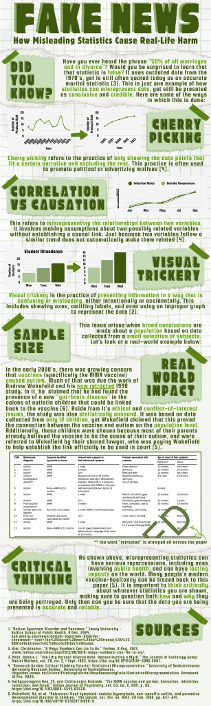
Fake News: How Misleading Statistics Cause Real-Life Harm
Tags from the story

Fiona Coulbourne
Hello! I am Fiona Coulbourne, and I am a Forensic Biology major at St. Mary's university.
Author Portfolio PageRecent Comments


The Promise and Perils of Genetic Editing: Germline Modifications in the Era of CRISPR
Sierra ReyesNovember 10, 2024


5 comments
Elizabeth Vazquez
Hello Fiona,
This semester, I have come to understand that information obtained from peer-reviewed sources and reputable academic journals is more reliable. I also learned that information can be biased if it presents only a single viewpoint or is based solely on opinion. In today’s world, it is important to recognize that everyone is susceptible to encountering false or misleading information, especially given that we often consume content from influencers and social media.
Maurissio Gonzalez
Hi Fiona! Statistics is not a simple topic; they can often be hard to understand if you do not have experience with them, unfortunately statistics are can be manipulated and people will trust them against their better judgement, thank you for talking about the different ways that statistics can be manipulated, you infographic is really well organized and simple to understand. Thank you.
Cielo Jerusalem Vargas
Hi Fiona,
I was actually surprised to learn that “50% of marriages” do not actually end in divorce. What a great way to capture the readers attention! This was quite an interesting infographic. I like how you clarified that just because two variables are following a similar pattern does not mean that they are related to one another. This places things into perspective about false information spread through visual trickery to fit a particular narrative. Great job on your infographic Fiona!
Samantha Garcia Mora
Hello Fiona! I am currently taking a statistics class, and much of the information in your infographic directly relates to the subjects I am learning. One key factor you mentioned was how small sample sizes can negatively impact public perception, specifically regarding the anti-vax movement. You did a great job explaining how misinformation and ill-made experiments can create widespread panic. Your project is very insightful!
Dr. Terry Jo Shackleford, Ph.D.
Great job on presenting this topic, Fiona! I like the way you started with a statistic we have all heard our whole lives and then showed how data can be skewed to tell the story the person presenting the information wants. It’s always smart to do our own research and see the data from every angle so we can make informed decisions. Very interesting infographic!