First of all I would like to congratulate all of my friends and peers from General Biology Two, Section D for publishing their articles. The effort and time put into such well designed infographics should be applauded and recognized. I hope you are all proud.
Secondly I would like to honor Dr. Terry Shackleford for her persistent editing and active engagement throughout the research project. She made the research project feel less like an assignment and more like a self accomplishment.
I would also like to sincerely thank my close friends and family for their endless support and encouragement throughout this time in my life.
Lastly, I would like to honor both Dr. Terry Shackleford and Dr. Bradford Whitener for presenting me with such an opportunity, this would not have been possible without the two of you and your support. Thank you so much.
April 22, 2023
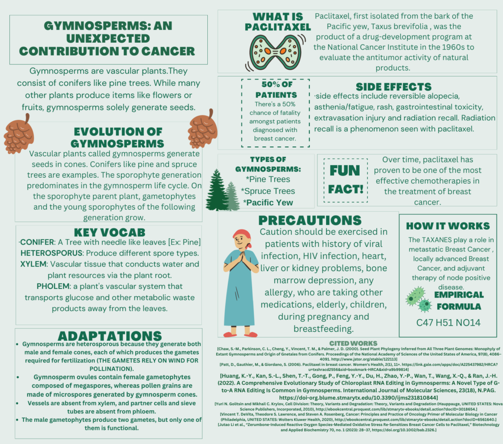
Gymnosperms: An Unexpected Contribution to Cancer

Tags from the story


47 comments
lramirez49
This is such an interesting piece of research, one I have never heard of before. I love how you included the key vocab section as a lot of this terminology used left me confused at first. The section about its contribution to cancer was very informative and makes me wonder what other natural products can have both negative/postive effects on this disease. Overall, very insightful!
angelina jaurrieta
I really enjoyed how this infographic connected plant biology to cancer research in such an unexpected and creative way. As someone who appreciates learning how nature contributes to medical advancements, this topic immediately caught my interest. The visuals helped explain complex ideas, and I liked how the information flowed logically. To make it even stronger, adding brief definitions for some of the scientific terms could help readers with less biology background feel more included. Overall, this infographic was engaging, educational, and showed how interdisciplinary science can lead to exciting discoveries.
allie woods
At first glance the infographic is very visually pleasing, the color palette chosen is a perfect mix of subtle neutrals and a hit of contrast colors. The visuals used a cute touch to each of the information boxes while managing to relate closely to the topic. There is a lot of information being used and the format of each box is perfect! It starts by providing just enough information then going more into detail about each concept. I think the bold headlines also help with organizing the page as if you are looking for specific information it is easy to find.
jdelafuente6
This is such a cute infographic! I thought it was super interesting to learn what paclitaxel is and how it is an effective chemotherapy for patients with breast cancer. I would have loved to see more on how it works. Now I am intrigued to know exactly what role TAXANES plays in metastatic breast cancer. I want to go into cancer research, so this poster was very fascinating it me. I always think it is so cool how some of our treatments come from nature. Great job!
Mikayla Trejo
Thank you for your submission Hunter! This is relevant information that I found in enlightening, and interesting. There seem to be a lot of words, but it was still concise, and I see it as an important information that needed to be included. Overall, this is a clear an interesting info graphic.
Mikayla Trejo
This info graphic was interesting. Thank you for your submission. While there seem to have been a lot of words, it was still concise and easy to read while being informational. The colors on the page or eye-catching, and I appreciate how this is beneficial and relevant information.
Alexis Silva
The design, color coordination, and pictures caught my attention during my first initial skim through.
Ms. Stiles does a commendable job at emphasizing the evolutionary significance of gymnosperms. The inclusion of a vocabulary section enhances audience understanding, while the precautions section ensures a comprehensive overview, making it a well-rounded educational resource. I now have a basic understanding of gymnosperms when prior to reading this infographic I had no knowledge.
Bella Cortez
This infographic was infographic did have a lot of words but it was easy to read. I was able to just read a few words and then understand by just looking at the symbols. While I was analyzing this infographic I noticed that just by at first glance it may look like you have too many words but, after fully going through the infographic you notice how well it flows.
Linda Aguilar
This infographic was informative and easy to read. The colors were soothing blue, gold and green. I love how you incorporated the pinecones in the infographic. Visually it was easy to read when you used different fonts sizes and the use of borders around 50% of patients and fun facts. At first glance it seemed you had a lot of information to review. After reviewing it flowed nicely.
jcortez24
Good Evening Hunter, I really enjoyed going through your infographic. Your title really caught my attention and made me continue to go through your project. While analyzing your infographic I was able to get your ideas that you were trying to reach across. The way you switched between those two fonts made it more fun to read. When talking about paclitaxel I loved how you showed a drawing of what that was.