Tags from the story
Heart Disease
Public Health and Medicine
Recent Comments
Matthew Holland
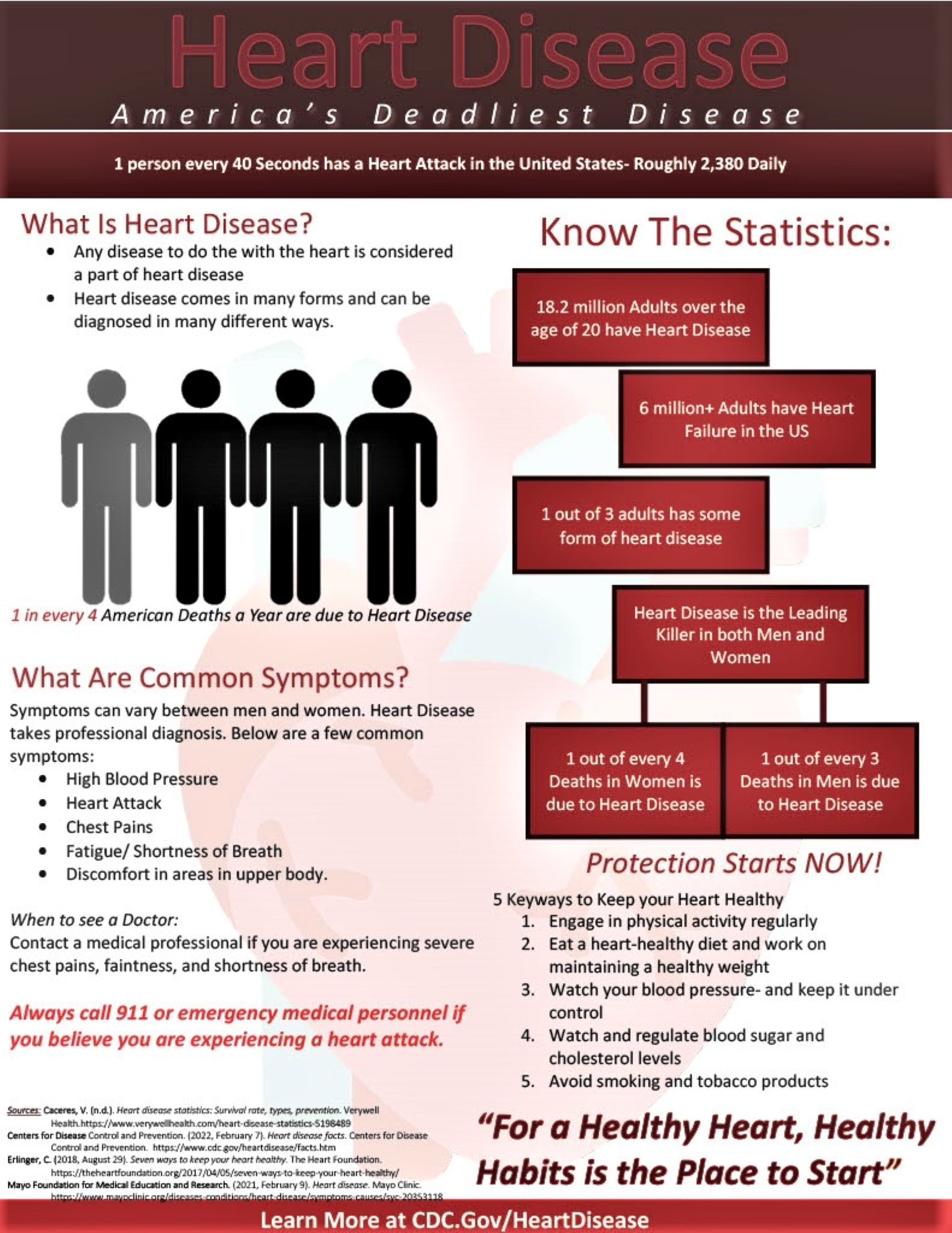
Great cohesive theme and color scheme altogether it looks like something you would see in a doctor’s office, very professional and it has a lot of good information that was straight to the point. While not being bogged down with too many words or excessive pictures. It’s crazy to think that there are almost 2400 daily cases of heart attacks in the United States, but it’s still not treated as serious of an issue as other diseases.
26/03/2023
4:45 pm
Elias Muniz
I really like the lay out of the infographic, the color choice fits the theme while still making it easy to read. The statistic about 1 in 4 Americans sticks out and grabs the attention, the final quote about a healthy heart is a good ending as it creates a catchphrase that makes this memorable. I would recommend changing the font size in the header.
26/03/2023
4:45 pm
Carina Martinez
I loved this infographic because it felt very official. It seemed like something you would see on the walls of a doctor’s office. The color scheme works very well with the story of the infographic. Overall everything was very well planned out.
26/03/2023
4:45 pm
Melanie Fraire
I liked the way this infographic was organized and it presented excellent information as well. I found it really shocking how 1 in 4 American deaths a year are due to heart disease since that means it’s a common occurrence yet I don’t think I see as much awareness being spread as there should be on this issue.
26/03/2023
4:45 pm
Christian Lopez
Hey Kaitlyn, I really like the feeling of this infographic. While the information in the infographic provides necessary info, my many complement is the structure of the infographic. With the color scheme, the layout, and the flow with text and pictures allows for a professional looking infographic.
26/03/2023
4:45 pm
Esmeralda Gomez
The color choice was an excellent decision, as was the layout of this infographic. It is very throughout and planned out. It honestly looks like an infographic you see at a doctor’s office and the information on this infographic is very informative. Amazing infographic, I loved the color selection, the layout, the design of the transparent heart in the background. Excellent.
26/03/2023
4:45 pm
Victoria Dubois
The color scheme of the infographic, featuring shades of red to represent hearts, impressed me. The water mark was a great idea, and the design effectively conveyed the issue and how to prevent it. The infographic has so much information that is very important to know. Prior to viewing it, I had heard about heart disease but did not fully comprehend its impact. The initial statistics provided were eye-opening.
26/03/2023
4:45 pm
Alexander Garcia
This infographic was very good because it not only had a good color scheme but it also had an overall good message as well. Personally, I enjoyed this infographic a lot because as someone who has family members who suffer from heart illnesses I think it is really important to spread awareness of the dangers of heart disease. Not only did this infographic show the dangers of heart disease but it also showed what people can do to avoid heart illness as well, which is such a good message.
26/03/2023
4:45 pm
Fernando Milian Leyva
This infographic is an excellent visual representation that effectively communicates crucial information on a critical health issue. The organization of the content is well thought out, allowing for a seamless flow of information and making it easy for viewers to comprehend and retain the key messages. The color palette used is both aesthetically pleasing and purposeful, as it highlights important elements while maintaining a professional look. Additionally, the choice of fonts is appropriate, ensuring readability and contributing to the overall impact of the infographic.
26/03/2023
4:45 pm
Sierra Christa
I loved the color scheme because your talking about hearts it is shades of red and that is very clever. Great idea for the water mark as well. I think you did a great job on showing what the issue is and how we can prevent it from happening to us. The only thing I would keep in mind is the size of the font just because it is almost hard to see.
24/03/2023
4:45 pm