Hi Cynthia,
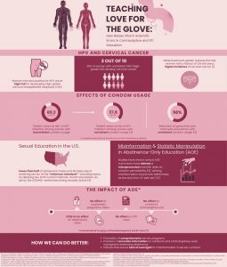
I really enjoyed reading your infographic, it was very easy to read and understand. I also really loved the colors that you used, they were simple and not overpowering at all, same with the images. I liked how each section was very well like summarized and straight to the point, I liked it because it kept me reading it was not overwhelming at all. Good job.
Loved your infographic! I liked how you used current examples this was really nice because although you give the definition or how it might be seen readers can connect the dots with more current events and understand it in a deeper meaning. One small adjustment I would change is to try using different fonts you can have a specific font style for titles and another one for the text. Not necessary but would help engage the reader.
Hi Cynthia, I like how your infographic is showing that the Constitution is still relevant even when it doesn’t give clear guidance. It talks about how courts, lawmakers, and citizens help fill in the gaps, making sure the country can function effectively. The visuals make the topic easy to understand, and it’s a strong reminder that staying involved and informed is key to a healthy democracy.
Hi Cynthia! I thought your article was great, it was straightforward and gave just the right amount of information! It wasn’t wordy to the point where it was overwhelming, it was nice and it flowed well! I enjoyed the little visuals as well! One suggestion would be, I think it be nice to see more modern day examples. Overall, great job!
Great job on your project. You did a great job captivating the judiciary review and explaining the right to privacy. I really liked how in-depth you went into the history, reasoning, and understanding of what and how judicial review works. I also found it very intriguing that you added a current example at the end to tie everything back to something we can all relate to. A piece of advice: I think if you made the title “When the Constitution Speaks in Silence,” you could have added a picture to make it more visually appealing. Overall, you did an amazing job with your infographic.
Hey Cynthia! Your infographic looks amazing! You did a great job clearly communicating the core message that “the courts use judicial review to protect implied rights like privacy, ensuring no branch oversteps and individuals can make personal decisions free from government interference.” The design is really visually appealing. I love the blue theme, and the whole layout feels clean, concise, and easy to follow. The visuals for each section were also really helpful in reinforcing the concepts. I especially liked the current examples at the end. They make the content relatable and show how these principles are still being applied today. One suggestion I’d offer is to adjust the title on the second page so it isn’t identical to the first. A more specific or unique title there could help differentiate the sections and guide the reader even better. Overall, super impressive work!
Hello Cynthia, excellent job! I enjoyed the layout and simplicity of the infographic, it makes it easy to read and focus on the substance of it. I also liked the discussion of individual liberty and how that ties into the implied right to privacy. If I had to make a suggestion it would just be to explain what the ACLU and EFF are, because some people might not be very familiar with those organizations.
Hi Cynthia!
Your infographic title immediately caught my attention—I was intrigued by all the information you presented. It serves as an excellent reference for understanding key concepts such as checks and balances, separation of powers, and judicial authority. One suggestion I have would be to include a table of contents to help keep the information well organized and easy to navigate.
Hi Cynthia!
Great job on this infographic! You explained judicial review and implied rights very clearly, and the inclusion of Supreme Court cases was extremely effective in illustrating real-world applications of these concepts. I especially enjoyed learning about the 2018 Supreme Court case related to implied rights, which is highly relevant in today’s digital era. Your organization of information is visually appealing and well structured. However, it might be more impactful to reserve bold formatting for section titles and key terms rather than applying it broadly, as this would help draw the reader’s attention to the most important points. Additionally, remember that APA reference entries should be listed in alphabetical order. Overall, this was an engaging infographic!
Cynthia, good job on your info-graph. I really liked your organization through out the pages and the pictures/visuals you decided to choose. I enjoyed how you included extremely important landmark cases that established those principles we have today, like Marbury v. Madison. I would recommend not including your title on every page and explaining what exactly ACLU and EFF is. Overall, excellent info-graph and super informative!

15 comments
Rosa Inocencio
Hi Cynthia,
I really enjoyed reading your infographic, it was very easy to read and understand. I also really loved the colors that you used, they were simple and not overpowering at all, same with the images. I liked how each section was very well like summarized and straight to the point, I liked it because it kept me reading it was not overwhelming at all. Good job.
Johana Solis
Cynthia
Loved your infographic! I liked how you used current examples this was really nice because although you give the definition or how it might be seen readers can connect the dots with more current events and understand it in a deeper meaning. One small adjustment I would change is to try using different fonts you can have a specific font style for titles and another one for the text. Not necessary but would help engage the reader.
Emilee Luera
Hi Cynthia, I like how your infographic is showing that the Constitution is still relevant even when it doesn’t give clear guidance. It talks about how courts, lawmakers, and citizens help fill in the gaps, making sure the country can function effectively. The visuals make the topic easy to understand, and it’s a strong reminder that staying involved and informed is key to a healthy democracy.
Ana Barrientos
Hi Cynthia! I thought your article was great, it was straightforward and gave just the right amount of information! It wasn’t wordy to the point where it was overwhelming, it was nice and it flowed well! I enjoyed the little visuals as well! One suggestion would be, I think it be nice to see more modern day examples. Overall, great job!
Miranda Reyna
Hey Cynthia,
Great job on your project. You did a great job captivating the judiciary review and explaining the right to privacy. I really liked how in-depth you went into the history, reasoning, and understanding of what and how judicial review works. I also found it very intriguing that you added a current example at the end to tie everything back to something we can all relate to. A piece of advice: I think if you made the title “When the Constitution Speaks in Silence,” you could have added a picture to make it more visually appealing. Overall, you did an amazing job with your infographic.
Sally Saleh
Hey Cynthia! Your infographic looks amazing! You did a great job clearly communicating the core message that “the courts use judicial review to protect implied rights like privacy, ensuring no branch oversteps and individuals can make personal decisions free from government interference.” The design is really visually appealing. I love the blue theme, and the whole layout feels clean, concise, and easy to follow. The visuals for each section were also really helpful in reinforcing the concepts. I especially liked the current examples at the end. They make the content relatable and show how these principles are still being applied today. One suggestion I’d offer is to adjust the title on the second page so it isn’t identical to the first. A more specific or unique title there could help differentiate the sections and guide the reader even better. Overall, super impressive work!
James Clifford
Hello Cynthia, excellent job! I enjoyed the layout and simplicity of the infographic, it makes it easy to read and focus on the substance of it. I also liked the discussion of individual liberty and how that ties into the implied right to privacy. If I had to make a suggestion it would just be to explain what the ACLU and EFF are, because some people might not be very familiar with those organizations.
Mia Ramirez
Hi Cynthia!
Your infographic title immediately caught my attention—I was intrigued by all the information you presented. It serves as an excellent reference for understanding key concepts such as checks and balances, separation of powers, and judicial authority. One suggestion I have would be to include a table of contents to help keep the information well organized and easy to navigate.
Jada Cano
Hi Cynthia!
Great job on this infographic! You explained judicial review and implied rights very clearly, and the inclusion of Supreme Court cases was extremely effective in illustrating real-world applications of these concepts. I especially enjoyed learning about the 2018 Supreme Court case related to implied rights, which is highly relevant in today’s digital era. Your organization of information is visually appealing and well structured. However, it might be more impactful to reserve bold formatting for section titles and key terms rather than applying it broadly, as this would help draw the reader’s attention to the most important points. Additionally, remember that APA reference entries should be listed in alphabetical order. Overall, this was an engaging infographic!
Victoria Cantu
Cynthia, good job on your info-graph. I really liked your organization through out the pages and the pictures/visuals you decided to choose. I enjoyed how you included extremely important landmark cases that established those principles we have today, like Marbury v. Madison. I would recommend not including your title on every page and explaining what exactly ACLU and EFF is. Overall, excellent info-graph and super informative!