
Purpose
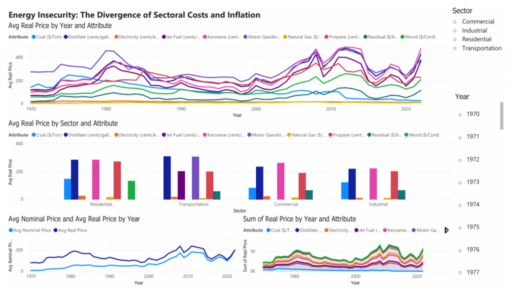
This report analyzes the evolution of energy prices in the United States from 1970 to 2022, focusing on how different sectors—residential, industrial, commercial, and transportation—have been affected by fluctuations in global energy markets. Using inflation-adjusted (real) prices, the infographic highlights the long-term impact of major economic shocks, including the 1970s oil crises and the 2008 commodity boom.
The findings reveal that energy prices are highly volatile and unevenly distributed across sectors. The transportation sector, in particular, remains the most vulnerable due to its dependence on petroleum-based fuels. Additionally, the divergence between nominal and real prices shows that historical periods such as the early 1980s imposed a greater economic burden than recent price increases.
This report argues that energy pricing is shaped not only by supply and demand but also by geopolitical events, inflation, and structural dependence on fossil fuels. The key recommendation is to prioritize energy diversification and resilience to reduce long-term economic vulnerability.
Background and Context
Historical Evolution of Energy Prices
Since 1970, U.S. energy markets have undergone significant transformations driven by global events, technological advancements, and policy changes. The 1973 and 1979 oil crises marked the beginning of extreme price volatility, exposing the risks of dependence on imported fossil fuels.
Over time, energy markets diversified, with natural gas and electricity playing increasingly important roles. However, fossil fuels, especially petroleum products, continue to dominate key sectors such as transportation.
Why Energy Prices Matter
Energy prices are central to economic stability for three main reasons:
Household Impact: Rising electricity and heating costs directly affect consumer welfare
Industrial Competitiveness: Energy-intensive industries rely on stable pricing
Macroeconomic Stability: Energy shocks often trigger inflation and economic downturns
Key Insights from the Infographic
1. Long-Term Price Volatility
The visualization shows that energy prices are not stable over time. Major spikes occur during:
- The 1970s oil crises
- The early 1980s peak (highest real prices)
- The 2008 global commodity boom
These fluctuations demonstrate how global geopolitical events directly impact domestic energy costs.
2. Sectoral Inequality in Energy Costs
Different sectors experience energy price changes differently:
- Transportation: Most volatile due to reliance on gasoline and jet fuel
- Residential: Moderately affected, especially by electricity and heating fuels
- Industrial & Commercial: More stable due to diversified energy use
This highlights structural differences in energy dependence across the economy.
3. Real vs Nominal Price Divergence
A critical insight from the dashboard is the difference between:
Nominal Prices (current dollars)
Real Prices (inflation-adjusted)
While recent prices appear high, the early 1980s represent the true peak in economic burden, showing that inflation plays a key role in interpreting energy costs.
Political Economy Interpretation
The infographic demonstrates that energy markets are deeply embedded in the global political economy. Price shocks are often triggered by:
- Geopolitical conflicts (e.g., Middle East oil disruptions)
- Supply constraints
- Global demand shifts
These external shocks are transmitted unevenly across sectors, amplifying economic vulnerability. The data suggests that reliance on fossil fuels creates systemic risk, particularly in sectors with limited substitution options.
Policy Implications
Option 1: Maintain Current Energy Structure
Advantages:
Low transition cost
Existing infrastructure remains useful
Disadvantages:
Continued exposure to global price shocks
High long-term volatility
Option 2: Promote Energy Diversification
Advantages:
Reduces dependence on fossil fuels
Improves price stability
Enhances economic resilience
Disadvantages:
Requires high initial investment
Transition complexity
Option 3: Sector-Specific Energy Policies
Advantages:
Targets most vulnerable sectors (e.g., transportation)
Improves efficiency
Disadvantages:
Uneven policy outcomes
Requires coordination
Recommendation
The United States should prioritize energy diversification and sectoral resilience strategies.
Key Actions:
Invest in renewable energy sources
Electrify transportation systems
Improve energy efficiency across sectors
Strengthen domestic energy production
How the Visualization Supports This Argument
The interactive dashboard allows users to:
Track energy price trends over time
Compare sector-level differences
Distinguish between nominal and real price impacts
By enabling filtering by sector and energy type, the visualization highlights how energy shocks propagate differently across the economy. This interactivity reinforces the argument that energy markets are complex, interconnected, and influenced by both economic and political forces.
Conclusion
Energy prices in the United States have been shaped by decades of global shocks, inflation, and structural dependence on fossil fuels. The infographic reveals that these effects are uneven across sectors and more severe in real terms than nominal prices suggest.
To ensure long-term economic stability, policymakers must move beyond short-term price management and focus on building a resilient, diversified energy system capable of withstanding future global disruptions.


3 comments
Mía Perez
This article clearly shows how U.S. energy prices are shaped by geopolitical shocks and long-term structural dependence on fossil fuels. The sectoral breakdown effectively highlights how transportation is most vulnerable, while industrial users are more insulated. The distinction between real and nominal prices is especially important for understanding historical burden and current policy debates on energy diversification and economic resilience.
Yosany
Hello Talal!
I think you did an excellent job with the way you organized and delivered your information. The graphs really show the changes in prices especially as they have been affected by crisises and other significant events. You sucessfully break down the information into smaller digestible pieces and allow a “walk through” for the reader to understand. My only real suggestion would be perhaps a simplification of the graphs or restructuring of the infographic. Without the additional written information, the media is a little hard to read and overwhelming to look at. For someone that may not be used to this content may fail to prooperly understand its contents. Regardless it’s clear that you produced a clear and thoughtful analysis of energy prices.
Greitin Rodriguez
Hi! I really like how structured and thoughtfully created this infographic was. The big strength here is that you’ve clearly illustrated the disconnect between what consumers see as “price” and the true price inflation-adjusted. In addition, the way you compare price movements across different economic sectors especially the vulnerability of the transportation sector’s reliance on petroleum-based fuels is excellent. Your ability to show how the reliance on petroleum-based fuels creates greater sectoral price volatility is really well-supported with your visualizations.
Additionally, I appreciated how your long-term historical chart illustrates large-scale shocks such as the 1970s oil crisis and the 2008 commodities boom. These will serve to demonstrate how although changes in the cost of energy can be determined by supply and demand conditions, they are also affected by geopolitical and structural considerations. This reinforces your overall case on energy insecurity.
Finally, I would recommend emphasizing or using call-out boxes for two to three important observations from the data you provided. With all the data being given at once, this might confuse the reader initially. Focusing their attention to 2–3 key findings will add to your overall argument.
All in all, you have produced a solid and thoughtful analysis. Are you thinking that a move to renewable energy would produce a similar level of price volatility reduction for ALL sectors, or do you believe that certain sectors such as transportation will remain particularly vulnerable through the transition period?