Acknowledgements: I would like to thank Dr. Lori Boies for helping me immensely in the process of this infographic, specifically when it came to fixing my topic. I am grateful for being given the opportunity to create my first official infographic in a study I have never truly read about until she pushed me a little to find a different story best for my topic. I am also incredibly grateful for Dr. Boies finally convincing me after three years of knowing her to take on this course and potentially a bioinformatics minor. Dr. Boies, thank you so much for everything!


8 comments
Jordan Robbins
Hi, through your writing I learned so much more about survival in these scenarios. I really wonder how many people could be saved if these things were paid attention to more often. I like how you made your infographic look, too. What made you interested in a topic like this?
Anna Marie
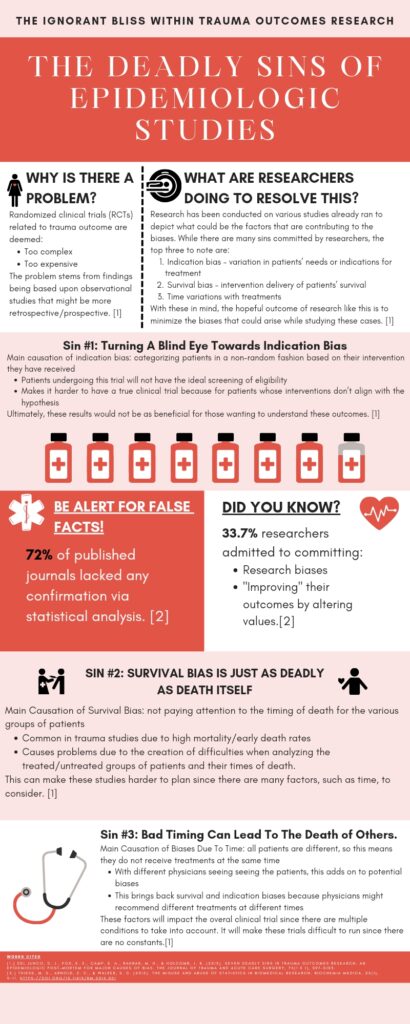
This infographic was very informative. I did not realize that survival bias is common in trauma studies and the impact could lead to more death in patients. It seems that people often try group several individuals into the same category which can cause many problems including death according to your infographic. Very well done, I really enjoyed the optimal use of space. You used it very wisely and were able to say everything you needed too in a small space.
Melany Cervantes
Hey Franchesca, your choice of words immediately hooked my attention, you did a wonderful job on this infographic. I appreciate that you brought light to this as I had no knowledge and had assumed that research conducted for patients would be accurate and truthful to create better treatment plans or prevent death. Astonishingly, there is a percentage of over 5% of researchers that admitted to bias and altering their values. This makes me believe it should be a bigger statistic as it does not account for researchers who weren’t involved in that survey.
Kenya Rosas
Hi Franchesca! Congratulations on your win, I can see it is very well deserved! First of all, the design of your infographic is beautiful, super aesthetically pleasing and captivating. Furthermore, your infographic allowed me to learn so much about the misconduct in epidemiologic studies without feeling overwhelmed. My only advice would be to make the text at the top a little larger as it can be hard to read all the introductory information.
Silvia Benavides
This is a great infographic! I never thought about how something as mundane as time could greatly impact the outcomes of patients. You did a great job.
Carlos Anthony Alonzo
Your infographic on all the ‘deadly sins’ of epidemiological studies offers crucial insights into the often overlooked criteria for such studies. By exploring these issues, such as the bias, confounding, and misinterpretation, it cleverly sheds light and defines the problems. Researchers in epidemiological studies should be aware of these issues and operate with rigor and integrity to produce the best and accurate results. Well done!
Naya Harb
Hi Franchesca! This is such a good informative infographic! I honestly have never learned about this before. It is sad and disappointing to know that some researchers improve their outcomes by altering values, especially because they can put a lot of lives at risk for their own benefit. Great infographic though it looks really pleasing to the eye and makes you want to read it and learn more! Congratulations!
Esmeralda Gomez
Hi! This was a very fascinating infographic to both look at and learn from. This pairs well with another infographic I had previously learned about academics falsifying evidence and the consequences that follow those who do. This was a great additive to that information. The colors chosen and the way the information was laid out was an excellent choice. Great job and congratulations on your nomination!