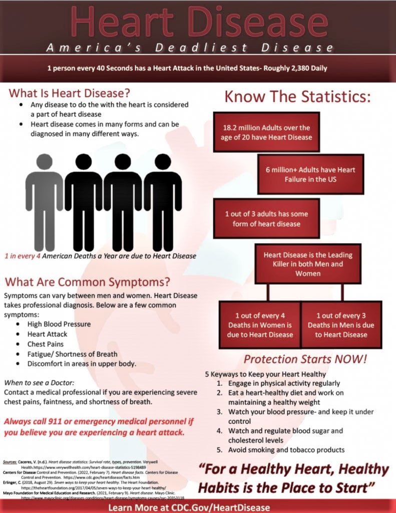
Great article! The color scheme and title really attract the attention and sets a theme for the infographic. The information, statistics emphasize well the importance of raising awareness for heart disease. The outline presented states a clear story of heart disease and also information and statistics to support your stated information. Great job Kaitlyn!
I think this infographic utilized a good layout and eye-catching components to create an effective content-driven analysis of the issue of heart disease. I also liked the cohesive color scheme used in the infographic as well. I like how the creator explains what the issue is and how to prevent the issue from occurring in the first place. This is important to know as heart disease is largely preventable. I also liked the addition of a resource to use in the event you or someone you know is believed to be experiencing a heart attack and/or needs immediate attention. Lastly, the addition of the slogan, “For a healthy heart, good habits is the place to start.”This effectively summarizes the information presented and leaves an impression in the reader’s mind.
I thought this infographic was really interesting and detailed. This infographic consists of a bunch of important lifesaving information that most people do not know about. This infographic does a great job of communicating important facts about a serious health problem. The content is thoughtfully organized, allowing for a smooth flow of information and making it simple for viewers to understand and remember the essential themes. The color scheme used highlights significant features while keeping a professional appearance, making it both aesthetically pleasant and functional. The major concepts are laid forth in an accessible manner, and the fascinating title underscores the value of spreading awareness about heart disease. I also appreciated the fact that there were resources offered for the readers to look at if they desired further information.
I felt that this infographic had a bit of a choppy flow to it. It was hard to follow the cohesivity of it, and I feel that if it were easier to follow it could provide a good amount of useful information to the reader. I felt that the infographic provided a good mix of statistics and graphics, but it needed to be more cohesive to understand the information presented in the easiest way.
I felt that this infographic had a bit of a choppy flow to it. It was hard to follow the cohesivity of it, and I feel that if it were easier to follow it could provide a good amount of useful information to the reader. I felt that the infographic provided a good mix of statistics and graphics, but it needed to be more cohesive to understand the information presented in the easiest way.
Hi Kaitlyn! I did not realize how many people were suffering from or at risk for heart disease. The statistics were truly shocking, and the addition of them definitely caught my attention. I also liked the color scheme that you used. It went well with the information. Thank you again.
I really enjoyed how this infographic was articulated. Your word choice and tone of the infographic made it easy and enjoyable to follow. I also liked the color scheme and the way the infographic was organized. This is a very important and serious topic to be talked about, and the way you formatted the infographic sure made me want to follow along and pay attention. Great job, Kaitlyn.
The formatting of this infographic is very helpful in directing the reader through this very important information about heart disease, an ailment that your statistics show is very prevalent among Americans. Combining stats showing what a common problem this is along with the warning signs to look for, instructions on what to do, and preventative measures offers the reader a comprehensive step by step that answers the broad questions we all have.
This is a very well thought out infographic with its use of white and red, as well as a clearly readable font. The information is well displayed, and it is easy to digest and understand the information at hand. Not just that but, I enjoyed how you included a section that showed ways to treat and avoid heart disease. The one critique I have is that the citations fade into the odd red bar at the bottom. Otherwise, it is an extremely well made and professional infographic.
This is an excellent infographic on heart disease. The intriguing title emphasizes the importance of raising awareness about heart disease, and the main points are organized in an easy-to-read format. Along with providing interesting information, the infographic’s design and colors contribute to the overall theme. I also liked how there were resources provided for people to look at if they wanted to learn more.


50 comments
Alejandra Pardo
Great article! The color scheme and title really attract the attention and sets a theme for the infographic. The information, statistics emphasize well the importance of raising awareness for heart disease. The outline presented states a clear story of heart disease and also information and statistics to support your stated information. Great job Kaitlyn!
Karah Renfroe
I think this infographic utilized a good layout and eye-catching components to create an effective content-driven analysis of the issue of heart disease. I also liked the cohesive color scheme used in the infographic as well. I like how the creator explains what the issue is and how to prevent the issue from occurring in the first place. This is important to know as heart disease is largely preventable. I also liked the addition of a resource to use in the event you or someone you know is believed to be experiencing a heart attack and/or needs immediate attention. Lastly, the addition of the slogan, “For a healthy heart, good habits is the place to start.”This effectively summarizes the information presented and leaves an impression in the reader’s mind.
Karicia Gallegos
I thought this infographic was really interesting and detailed. This infographic consists of a bunch of important lifesaving information that most people do not know about. This infographic does a great job of communicating important facts about a serious health problem. The content is thoughtfully organized, allowing for a smooth flow of information and making it simple for viewers to understand and remember the essential themes. The color scheme used highlights significant features while keeping a professional appearance, making it both aesthetically pleasant and functional. The major concepts are laid forth in an accessible manner, and the fascinating title underscores the value of spreading awareness about heart disease. I also appreciated the fact that there were resources offered for the readers to look at if they desired further information.
Jacqueline Galvan
I felt that this infographic had a bit of a choppy flow to it. It was hard to follow the cohesivity of it, and I feel that if it were easier to follow it could provide a good amount of useful information to the reader. I felt that the infographic provided a good mix of statistics and graphics, but it needed to be more cohesive to understand the information presented in the easiest way.
Jacqueline
I felt that this infographic had a bit of a choppy flow to it. It was hard to follow the cohesivity of it, and I feel that if it were easier to follow it could provide a good amount of useful information to the reader. I felt that the infographic provided a good mix of statistics and graphics, but it needed to be more cohesive to understand the information presented in the easiest way.
Maya Naik
Hi Kaitlyn! I did not realize how many people were suffering from or at risk for heart disease. The statistics were truly shocking, and the addition of them definitely caught my attention. I also liked the color scheme that you used. It went well with the information. Thank you again.
Natalia Bustamante
I really enjoyed how this infographic was articulated. Your word choice and tone of the infographic made it easy and enjoyable to follow. I also liked the color scheme and the way the infographic was organized. This is a very important and serious topic to be talked about, and the way you formatted the infographic sure made me want to follow along and pay attention. Great job, Kaitlyn.
Joseph Frausto
The formatting of this infographic is very helpful in directing the reader through this very important information about heart disease, an ailment that your statistics show is very prevalent among Americans. Combining stats showing what a common problem this is along with the warning signs to look for, instructions on what to do, and preventative measures offers the reader a comprehensive step by step that answers the broad questions we all have.
Maximillian Morise
This is a very well thought out infographic with its use of white and red, as well as a clearly readable font. The information is well displayed, and it is easy to digest and understand the information at hand. Not just that but, I enjoyed how you included a section that showed ways to treat and avoid heart disease. The one critique I have is that the citations fade into the odd red bar at the bottom. Otherwise, it is an extremely well made and professional infographic.
Mia Garza
This is an excellent infographic on heart disease. The intriguing title emphasizes the importance of raising awareness about heart disease, and the main points are organized in an easy-to-read format. Along with providing interesting information, the infographic’s design and colors contribute to the overall theme. I also liked how there were resources provided for people to look at if they wanted to learn more.