Hi Victoria and Briana,
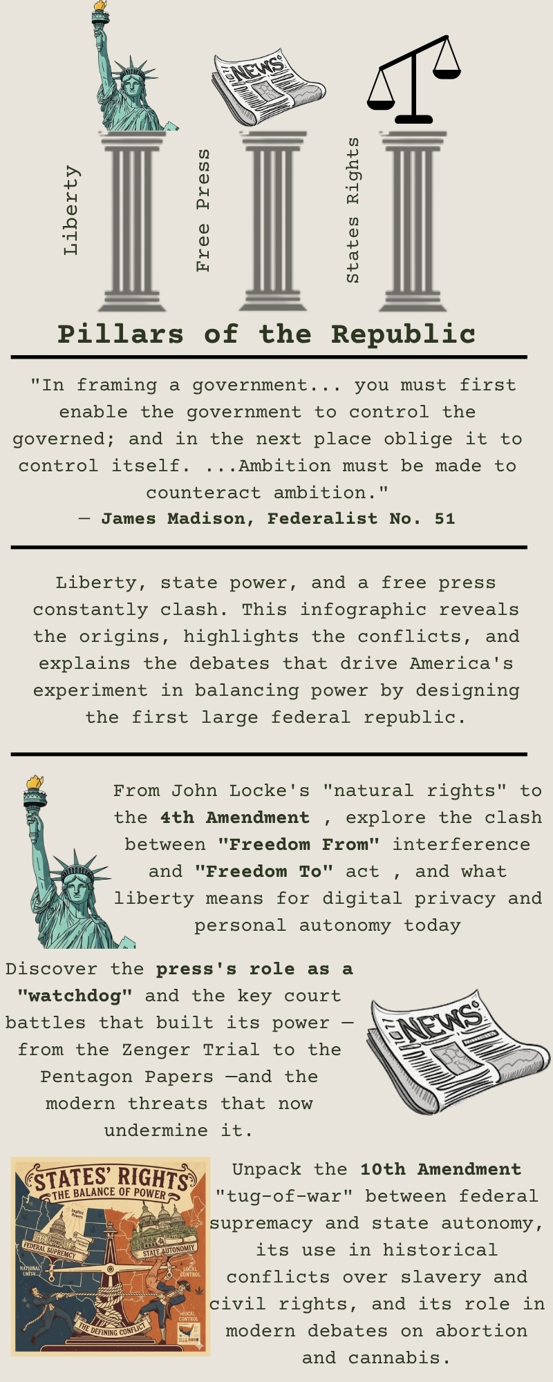
I really enjoyed reading y’all’s infographic, it was very informative, well structured, and eye-catching. Y’all did great with summarizing everything from beginning to end, which kept me interested because it was straight to the point. I liked how y’all added the section on Liberty in conflict and mentioned the historical challenges and modern debates. Good job!
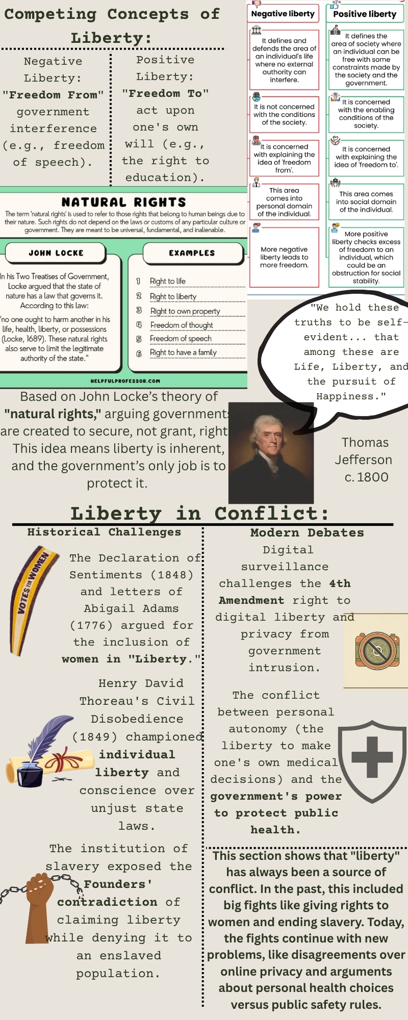
I loved this infographic! It gets straight to the point and gives the information it needed to give and it was information that would help someone with no prior knowledge of Pillars of Republic and Free Press. One thing I did struggle was to read the chart in page 2, I think with a different color it would be easier to read but other than that it’s a great infographic!
Hi Victoria and Briana,
I really like how this infographic shows the main elements that keep our republic strong. It shows that the rule of law, active citizen participation, and respect for institutions all play a role in supporting a healthy democracy. The visuals make it easy to understand, and it’s a good reminder that we all have a part in protecting these foundations for the country to thrive.
Hi Victoria and Briana! I really enjoyed how you set up the infographic, each pillar of the Republic were all represented well and were detailed! I enjoyed the Liberty in Conflict, and how you can see it still in modern day America. I enjoyed the visuals as well, but one recommendation I have would be on pg. 2, the images you have at the beginning are crowded. I would suggest making them smaller or adding another page for some more space. Overall, amazing job!
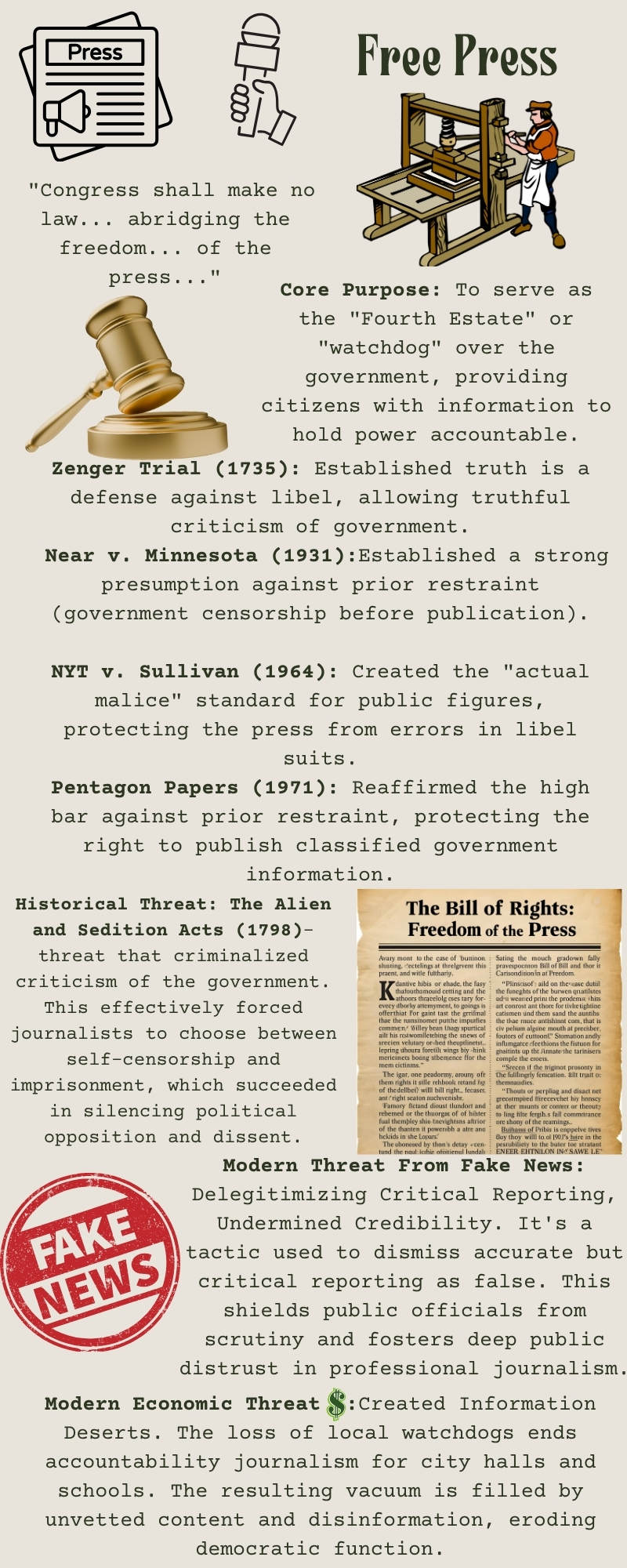
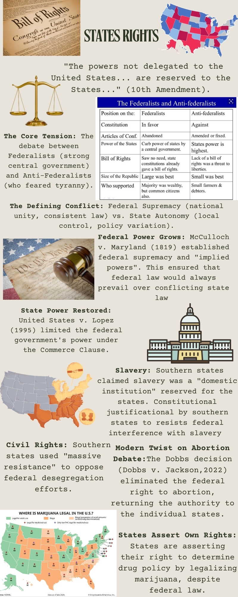
Your infographic was visually appealing and easy to read and follow along with. As a reader, I believe you guys did a great job explaining everything. This article can be read by a person without any prior knowledge of your principles and gain an understanding of them. I especially loved how you guys visually captured and created the Free Press and State’s Rights. The only thing I would have done differently is on page 2, I would have changed the graphs’ colors to match the rest of the aesthetic. Overall, I think you guys did a wonderful job.
Your infographic turned out amazing! The main idea that “America’s experiment in a large federal republic developed through ongoing tension between liberty, government power, and a free press” really came through clearly. I was immediately drawn in by the clean layout and strong visuals. I also really liked how on the fourth page you bolded key terms; it made it easy to quickly spot important ideas. Noticing the Federalist vs. Anti-Federalist chart from class was great too, awesome use of course materials! One thing I would recommend focusing on is page 2. There’s a lot of valuable information there, but since everything is on one page, it can feel a little overwhelming. Breaking it into two pages and bumping up the text size could help make it easier to read and understand while still keeping all the key points. Overall, you all did a fantastic job!
Hi Briana and Victoria,
As a reader, it was easy to understand the message of the infographic. I enjoyed learning about the correlation between liberty, state power, and freedom of the press. The historical aspect of this infographic helped me, as a reader, understand exactly how all the people came into place.
Moreover, this infographic needs some sort of table of contents because, as a reader, I found it a bit difficult to closely define all the arguments. For example, on page 1, all the principles are labeled, and I feel the principles should’ve been highlighted. One outstanding feature is that there was so much information provided however it did feel overwhelming to identify each principle and the specific information.
Hi Brianna and Victoria!
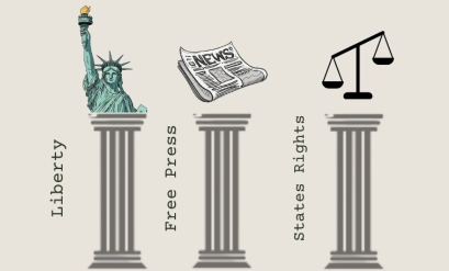
This infographic is thoughtfully designed and visually engaging, making it easy to analyze and interpret! The illustrations of liberty, freedom of the press, and states’ rights are effectively represented through the imagery of Lady Liberty, the newspaper, and the balance beam symbolizing both Federalist and Anti-Federalist perspectives. I particularly enjoyed the clear separation of negative and positive liberty on page 2, which adds strong conceptual understanding to the difference. Not to mention, the use of typewriter font was incredibly clever! My main suggestion would be to reduce the negative space on the reference pages, as the previous pages are visually rich and cohesive with many words and pictures. Minimizing that empty space would help maintain the overall momentum and balance of the infographic all the way to the end. All in all, a fantastic job! I enjoyed learning how these broad principles can be shown historically and modernly!
Hello Brianna and Victoria, your infographic was very visually appeaeling! I really liked the font and how it reflects that of an old school type writer, it was very eye catching as I read through the information. I especially liked how you opened with a quote by James Madison. I always find that this is a great way to hook your reader. Distinguishing the difference between freedom from interference and freedom to act in the context of liberty was very helpful when reading about past historical challenges regarding liberty as well as modern debates. If I could change one thing I think it would have been to maybe add a little more visual structure, such as text boxes, to the infographic. However, this is a wonderful infographic and I really enjoyed learning more about these important principles and how we are still seeing conflicts regarding the press in today’s society with issues surrounding “fake news.” Wonderful job!
I really enjoyed the infographic as it captivated me to want to keep learning about the pillars of the republic. Your work of colors and images made it easy to the eye; however, examples like in page 2, you have some areas where your information sections overlap your images and decor. I would try to fix it as it can make it look like it’s too much happening. For your other pages, I love all the information you’re trying to showcase but it can definitely come off as a mash since there aren’t any barriers from keeping the different boxes of information from clashing. Your images and charts are fantastic as they pair perfectly with your information! Overall amazing job and congratulations!


14 comments
Rosa Inocencio
Hi Victoria and Briana,
I really enjoyed reading y’all’s infographic, it was very informative, well structured, and eye-catching. Y’all did great with summarizing everything from beginning to end, which kept me interested because it was straight to the point. I liked how y’all added the section on Liberty in conflict and mentioned the historical challenges and modern debates. Good job!
Johana Solis
Victoria and Brianna
I loved this infographic! It gets straight to the point and gives the information it needed to give and it was information that would help someone with no prior knowledge of Pillars of Republic and Free Press. One thing I did struggle was to read the chart in page 2, I think with a different color it would be easier to read but other than that it’s a great infographic!
Emilee Luera
Hi Victoria and Briana,
I really like how this infographic shows the main elements that keep our republic strong. It shows that the rule of law, active citizen participation, and respect for institutions all play a role in supporting a healthy democracy. The visuals make it easy to understand, and it’s a good reminder that we all have a part in protecting these foundations for the country to thrive.
Ana Barrientos
Hi Victoria and Briana! I really enjoyed how you set up the infographic, each pillar of the Republic were all represented well and were detailed! I enjoyed the Liberty in Conflict, and how you can see it still in modern day America. I enjoyed the visuals as well, but one recommendation I have would be on pg. 2, the images you have at the beginning are crowded. I would suggest making them smaller or adding another page for some more space. Overall, amazing job!
Miranda Reyna
Victoria, Briana
Your infographic was visually appealing and easy to read and follow along with. As a reader, I believe you guys did a great job explaining everything. This article can be read by a person without any prior knowledge of your principles and gain an understanding of them. I especially loved how you guys visually captured and created the Free Press and State’s Rights. The only thing I would have done differently is on page 2, I would have changed the graphs’ colors to match the rest of the aesthetic. Overall, I think you guys did a wonderful job.
Sally Saleh
Your infographic turned out amazing! The main idea that “America’s experiment in a large federal republic developed through ongoing tension between liberty, government power, and a free press” really came through clearly. I was immediately drawn in by the clean layout and strong visuals. I also really liked how on the fourth page you bolded key terms; it made it easy to quickly spot important ideas. Noticing the Federalist vs. Anti-Federalist chart from class was great too, awesome use of course materials! One thing I would recommend focusing on is page 2. There’s a lot of valuable information there, but since everything is on one page, it can feel a little overwhelming. Breaking it into two pages and bumping up the text size could help make it easier to read and understand while still keeping all the key points. Overall, you all did a fantastic job!
Mia Ramirez
Hi Briana and Victoria,
As a reader, it was easy to understand the message of the infographic. I enjoyed learning about the correlation between liberty, state power, and freedom of the press. The historical aspect of this infographic helped me, as a reader, understand exactly how all the people came into place.
Moreover, this infographic needs some sort of table of contents because, as a reader, I found it a bit difficult to closely define all the arguments. For example, on page 1, all the principles are labeled, and I feel the principles should’ve been highlighted. One outstanding feature is that there was so much information provided however it did feel overwhelming to identify each principle and the specific information.
Jada Cano
Hi Brianna and Victoria!
This infographic is thoughtfully designed and visually engaging, making it easy to analyze and interpret! The illustrations of liberty, freedom of the press, and states’ rights are effectively represented through the imagery of Lady Liberty, the newspaper, and the balance beam symbolizing both Federalist and Anti-Federalist perspectives. I particularly enjoyed the clear separation of negative and positive liberty on page 2, which adds strong conceptual understanding to the difference. Not to mention, the use of typewriter font was incredibly clever! My main suggestion would be to reduce the negative space on the reference pages, as the previous pages are visually rich and cohesive with many words and pictures. Minimizing that empty space would help maintain the overall momentum and balance of the infographic all the way to the end. All in all, a fantastic job! I enjoyed learning how these broad principles can be shown historically and modernly!
Haley Aleman
Hello Brianna and Victoria, your infographic was very visually appeaeling! I really liked the font and how it reflects that of an old school type writer, it was very eye catching as I read through the information. I especially liked how you opened with a quote by James Madison. I always find that this is a great way to hook your reader. Distinguishing the difference between freedom from interference and freedom to act in the context of liberty was very helpful when reading about past historical challenges regarding liberty as well as modern debates. If I could change one thing I think it would have been to maybe add a little more visual structure, such as text boxes, to the infographic. However, this is a wonderful infographic and I really enjoyed learning more about these important principles and how we are still seeing conflicts regarding the press in today’s society with issues surrounding “fake news.” Wonderful job!
America Rosales
I really enjoyed the infographic as it captivated me to want to keep learning about the pillars of the republic. Your work of colors and images made it easy to the eye; however, examples like in page 2, you have some areas where your information sections overlap your images and decor. I would try to fix it as it can make it look like it’s too much happening. For your other pages, I love all the information you’re trying to showcase but it can definitely come off as a mash since there aren’t any barriers from keeping the different boxes of information from clashing. Your images and charts are fantastic as they pair perfectly with your information! Overall amazing job and congratulations!