References
The Budget Lab at Yale. (2025). State of U.S. tariffs. https://budgetlab.yale.edu/research/state-us-tariffs-october-17-2025
Pricing Lab. (n.d.). Tariff tracker. https://www.pricinglab.org/tariff-tracker/

References
The Budget Lab at Yale. (2025). State of U.S. tariffs. https://budgetlab.yale.edu/research/state-us-tariffs-october-17-2025
Pricing Lab. (n.d.). Tariff tracker. https://www.pricinglab.org/tariff-tracker/



6 comments
Elizabeth Vazquez
Hello Eduarda,
Following a Supreme Court decision invalidating Trump-era tariffs implemented under a 1977 law, the United States is now processing approximately $166 billion in refunds to businesses through a newly established CAPE portal for claim submissions. This development is positive news for corporations and businesses; however, it raises questions about the impact on consumers. Currently, there is limited discussion regarding how affected citizens will be compensated or what form any such restitution might take.
Gary Gorrell
Good Morning Eduarda,
I was particularly interested in your infographic because my final paper discusses tariffs and how the tariff costs are pushed to the consumer. It’s good to see some additional discussion about it. I like how you point out that tariffs don’t just affect other countries, but they also make things more expensive for regular people (consumers) as well. Identifying tariffs as a “hidden tax” makes that really clear. I also think your infographic does a good job showing both the good and bad sides of tariffs.
One thing that might make your infographic even better is adding a real world example of tariffs in action. That would help make the info even more relatable. In my own paper research, I think steel would be a good example. The tariffs affect the downstream industries that use steel (like auto manufactures) which makes cars more expensive. Just an idea, but great presentation!
saldossary
Good evening,
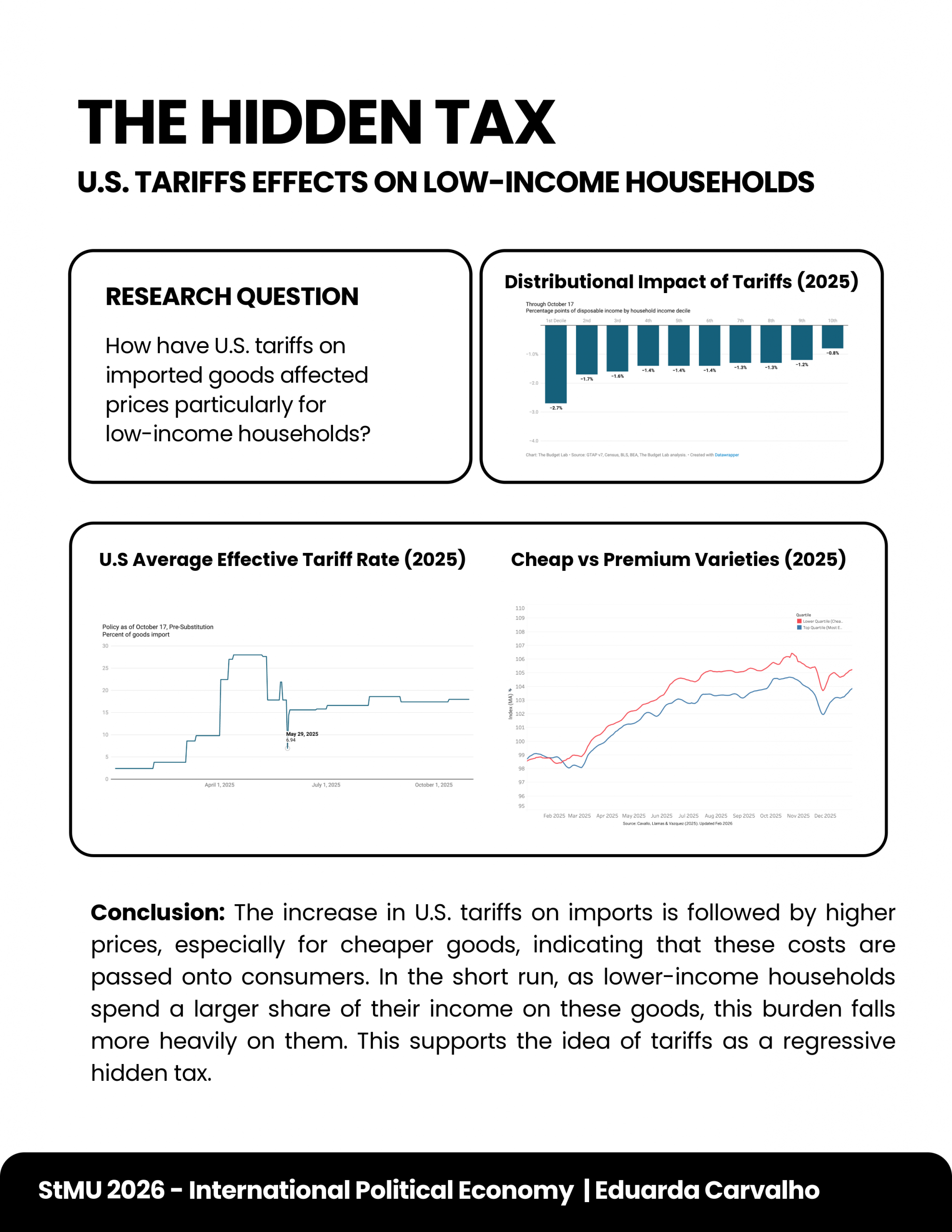
This is a very clear and interesting infographic. I really like your topic because it explains tariffs in a simple and practical way. The title “hidden tax” is strong and easy to understand. Your research question is clear, and the charts help explain how tariffs affect prices and especially low-income households. I also like your conclusion because it connects the data to real-life impact in a simple way. The layout is clean and easy to follow, which makes the information easy to understand. Overall, this is a strong and well-organized infographic. Great job!
Shaikha A. Aldossary
Stephen Minka
Eduarda, your infographic presents a very interesting view on tariffs that the U.S imposes on imported goods. You make a point that tariffs are like a “hidden tax” that affects lower-income Americans more. By showing how certain products increase in price faster than others, and breaking down taxes as a percentage of disposable income by different wage earners, you make a good case. If you could include where you found your information or justify how you got your information, that would be great! Thanks.
V/R
Minka
Greitin Rodriguez
I enjoyed how this graphic explained in detail that US tariffs can be viewed as “a hidden tax” to families with lower incomes. I like how you used several graphics especially the one comparing cheap and premium to show how price increases impact daily products much more than others. The conclusion did an excellent job of tying all of your points together and showed how the costs of tariffs were ultimately passed onto consumers and will negatively effect families at lower income levels. It was clear that you showed us how tariffs are not only a governmental decision but also create actual financial burdens for people of different income brackets.
Bennett Houston
Eduarda,
Your info graphic effectively demonstrates your point here. It makes it easy to understand the complex economic data that shows how tariff cost are most often passed on to consumers. I think the distinction between luxury and cheap goods really drives home your point.